case 05 / 05live
Novi Kvadrat Design System
One design system for a property platform, from the mark to the tokens, in light and dark.
- role
- Designer and developer of the system, end to end
- period
- since Dec 2025
- client
- Novi Kvadrat Group DOO
- platforms
- web · installable PWA
- credit
- Design & Development by SecretoCho for Novi Kvadrat Group DOO
- public
- novikvadrat.rs/en/press
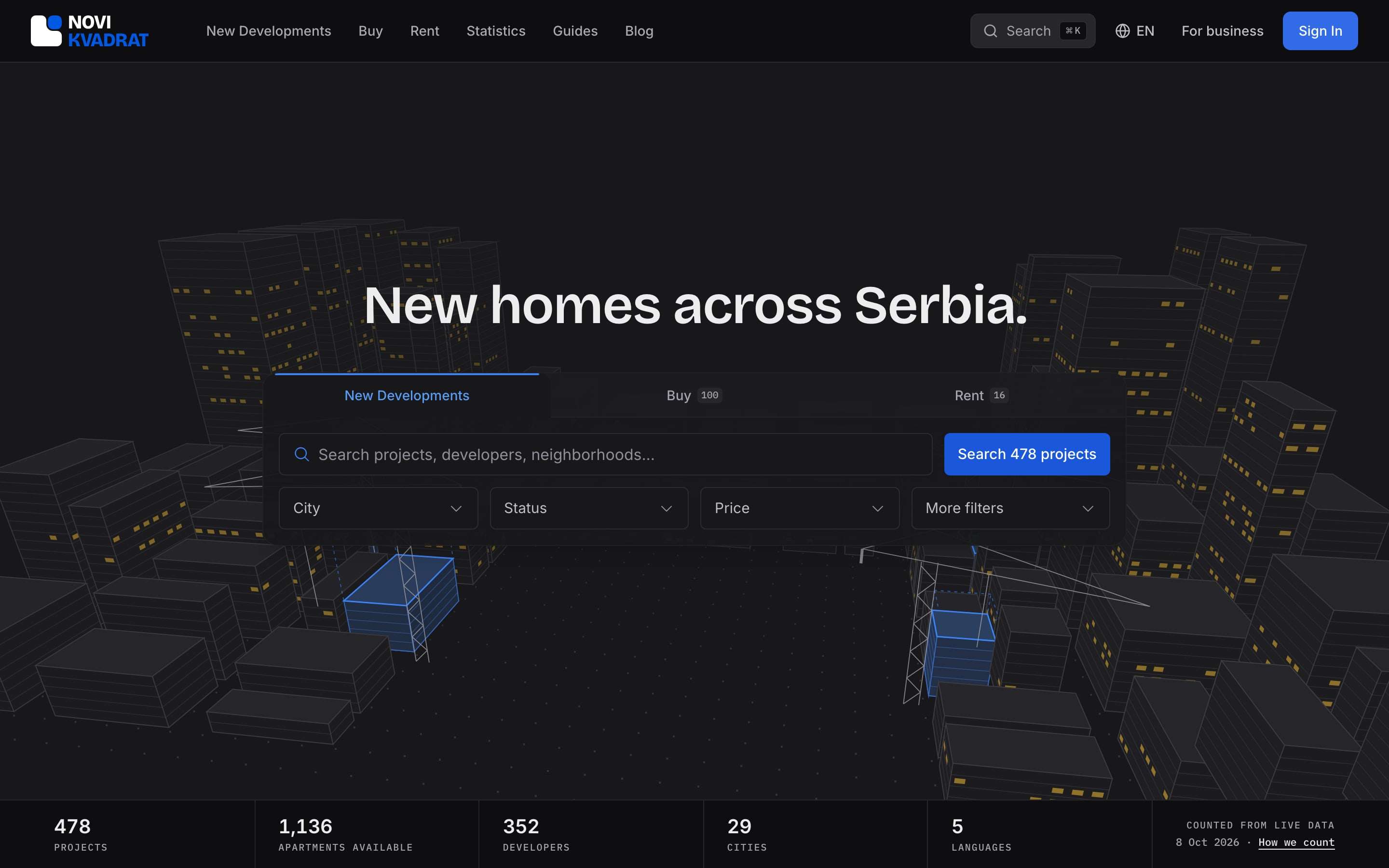
at a glance
- One system for the marketplaces, the business portal, the admin console and the studios, in five languages.
- 187 colour roles, each with a light and a dark value, 21 type steps and 11 spacing steps.
- Built twice: a 19-board, mobile-first library, then a code layer of about 350 files.
- Lint rules ban any colour or icon from outside the system.
- The press kit’s logos, rules and tokens are generated from the files the site is built from.
- colour roles, light and dark
- 187
- type steps
- 21
- visual-regression baselines
- 1,023
- files in the code layer
- ~350
Context
Novi Kvadrat runs on one design system. The marketplaces, the business portal, the admin console and the studios share it, in five languages, in light and dark. I designed it and built it, from the brand mark to the tokens.
The press kit at novikvadrat.rs/en/press is generated from the same files the site is built from: the logos, their rules, the colours, the typefaces and the design tokens.

The mark
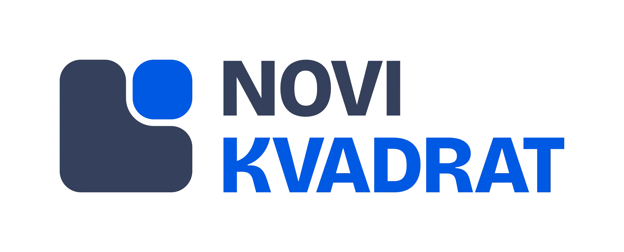
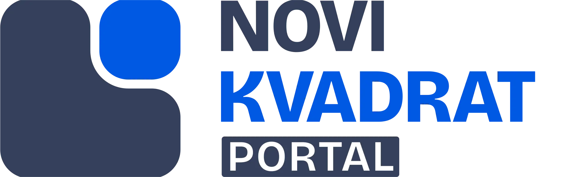
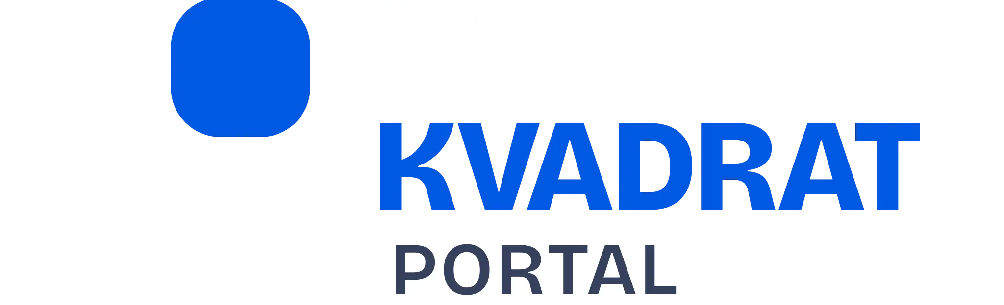
The logo and the mark each come in colour, reversed, black and white; a portal logo for partners comes in colour and reversed. The file is chosen by what sits behind it: colour on white and light grey, reversed on plain dark colour, white on NK Blue and on photos, black for one-colour print.
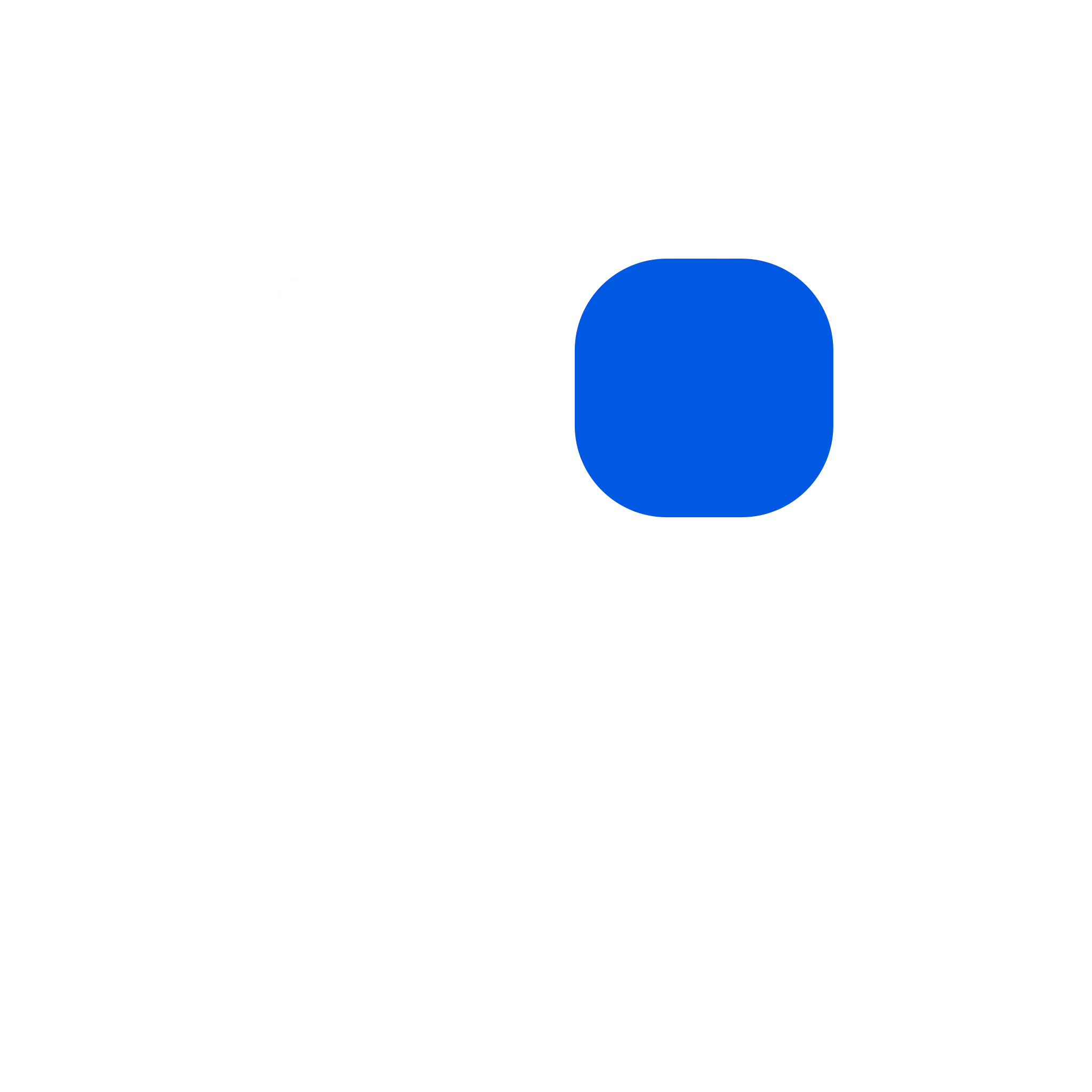
Clear space on every side equals the blue square, x. Nothing enters it. The logo is never shorter than 24 px on screen, the mark never smaller than 16 px.
The files are used exactly as supplied: never stretched, recoloured, rotated, shadowed, outlined, boxed or reset in another font, and never the retired 2025 artwork.
The name is two words, Novi Kvadrat, with a capital N and K in every language. It is never translated, never run together and never shortened in public copy.


Colour
NK Blue, #0058E3, and Slate, #34405C, belong to the logo only. The interface has its own interactive blue: #1A57DB in light, #3C83F6 in dark.
On white, NK Blue reaches 5.99 : 1 and Slate 10.32 : 1. On the dark ink, NK Blue drops to 3.21 : 1, for large text only, and Slate to 1.86 : 1, never for text.
187 colour roles carry the rest, each with a light and a dark value. A role is named for its job, not its colour: canvas, surface, ink, line, primary, danger.
- canvas#F8FAFC · #0E0E10--ds-canvas
- surface#FFFFFF · #18181B--ds-surface
- raised#F9FAFB · #131315--ds-raised
- line#E2E8F0 · #26262A--ds-line
- line-strong#CBD5E1 · #404045--ds-line-strong
- ink#020817 · #EDEDED--ds-ink
- text#384252 · #BFBFC4--ds-text
- sub#475569 · #A5A5AC--ds-sub
- muted#64748B · #8F8F99--ds-muted
- faint#94A3B8 · #666670--ds-faint
- primary#1A57DB · #3C83F6--ds-primary
- primary-strong#1842B4 · #5A9CF2--ds-primary-strong
- primary-soft#EAF1FD · #172136--ds-primary-soft
- on-primary#FFFFFF · #FFFFFF--ds-on-primary
- logo-a#0058E3 · #3C83F6--ds-logo-a
- logo-b#34405C · #565F78--ds-logo-b
- verified#16A249 · #3DDB77--ds-verified
- danger#DC2828 · #DC2828--ds-danger
- progress-warn#DB7706 · #F4BE34--ds-progress-warn
- data-cat-1#1A57DB · #5A9CF2--ds-data-cat-1
- data-cat-2#157F3C · #3DDB77--ds-data-cat-2
- data-cat-3#7C3AED · #A78BFA--ds-data-cat-3
- data-cat-4#0E7490 · #22D3EE--ds-data-cat-4
- data-cat-5#B35309 · #F4BE34--ds-data-cat-5
- data-cat-6#BA1C1C · #F07575--ds-data-cat-6
- data-seq-1#F9C489 · #F9C489--ds-data-seq-1
- data-seq-3#EC7D1E · #EC7D1E--ds-data-seq-3
- data-seq-5#9A4700 · #9A4700--ds-data-seq-5
Type
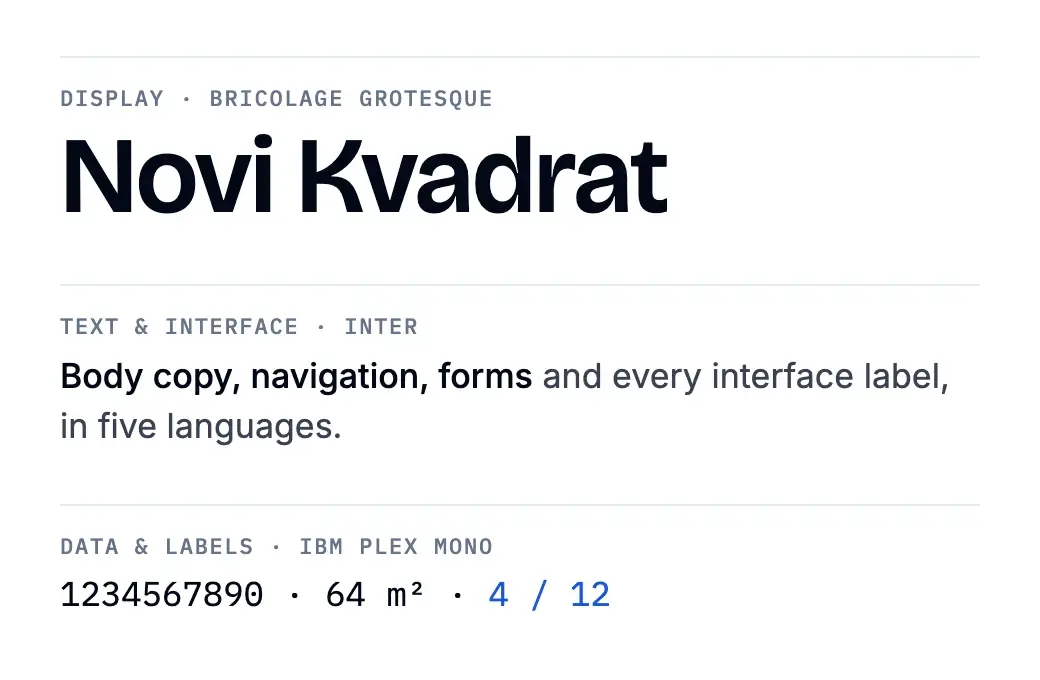
Three free typefaces, all on Google Fonts. Bricolage Grotesque sets public headings and big numbers, and never appears in the console. Inter sets the text and every interface label. IBM Plex Mono sets data and labels, always with tabular figures.
Bricolage Grotesque has no Cyrillic, so Russian pages fall back to Inter. 21 type steps cover every size the product uses.
| role | typeface |
|---|---|
| display | Bricolage Grotesque |
| text and interface | Inter |
| data and labels | IBM Plex Mono |
Tokens
The tokens are the values the product is built from. They are exported from the live system as W3C Design Tokens, in the DTCG 2025.10 format, in light and dark, and as CSS variables. The press kit and the site are generated from the same source.
Beside the colours: 11 spacing steps, 7 radii, 3 control heights, 3 shadows with the focus ring, 3 durations and 6 z-index layers.
| 2 | 2px |
|---|---|
| 4 | 4px |
| 6 | 6px |
| 8 | 8px |
| 10 | 10px |
| 12 | 12px |
| 16 | 16px |
| 20 | 20px |
| 24 | 24px |
| 32 | 32px |
| 40 | 40px |
| 4 | 4px |
|---|---|
| 5 | 5px |
| 6 | 6px |
| 8 | 8px |
| 12 | 12px |
| 16 | 16px |
| 999 | 999px |
| control.s | 30px |
|---|---|
| control.m | 36px |
| control.l | 44px |
| fade | 120ms |
|---|---|
| slide | 200ms |
| shimmer | 1400ms |
| header | 9999 |
|---|---|
| fullscreen | 10000 |
| modal | 10010 |
| popoverBackdrop | 10019 |
| popover | 10020 |
| tooltip | 10030 |
Two builds
The system was built twice: first as a 19-board, mobile-first library on canvas, then as a code layer of about 350 files. Lint rules ban any colour or icon from outside it, so the marketplaces, the portal and the admin console share one visual language. One icon library, Phosphor, covers every surface.
Light and dark
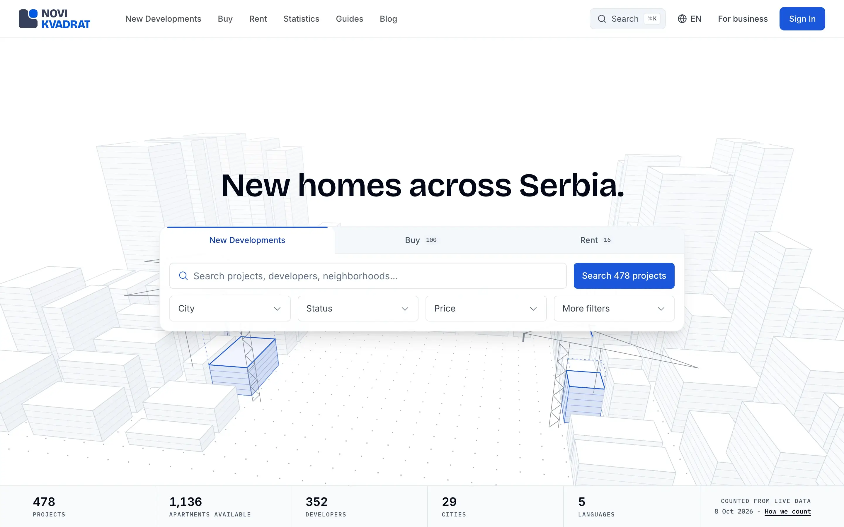
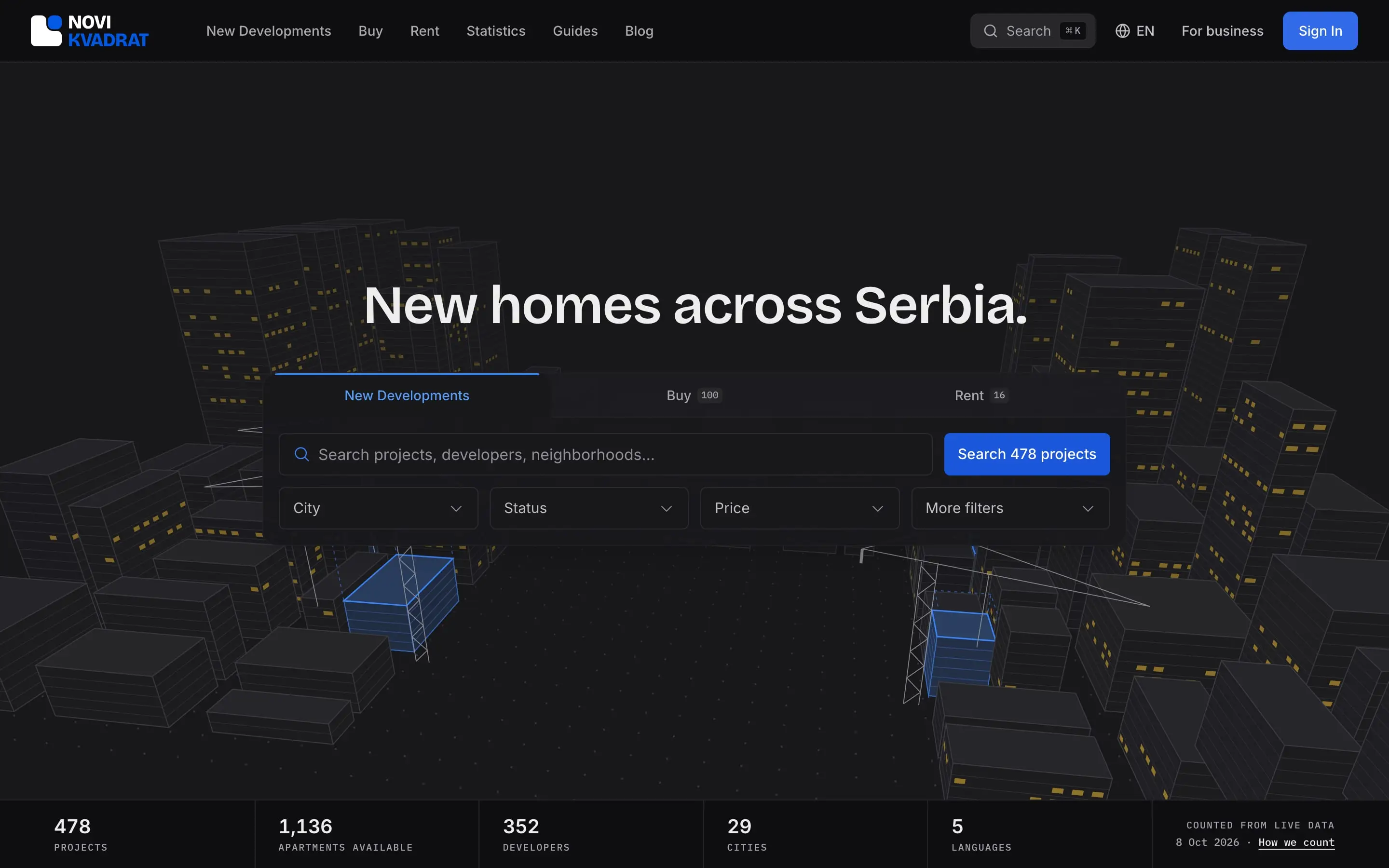
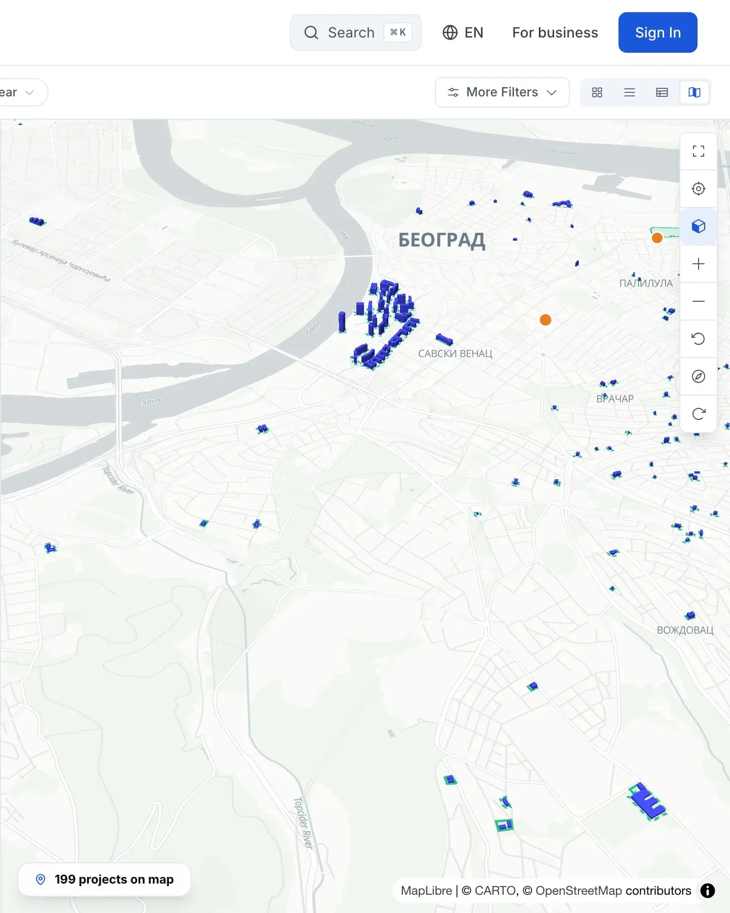
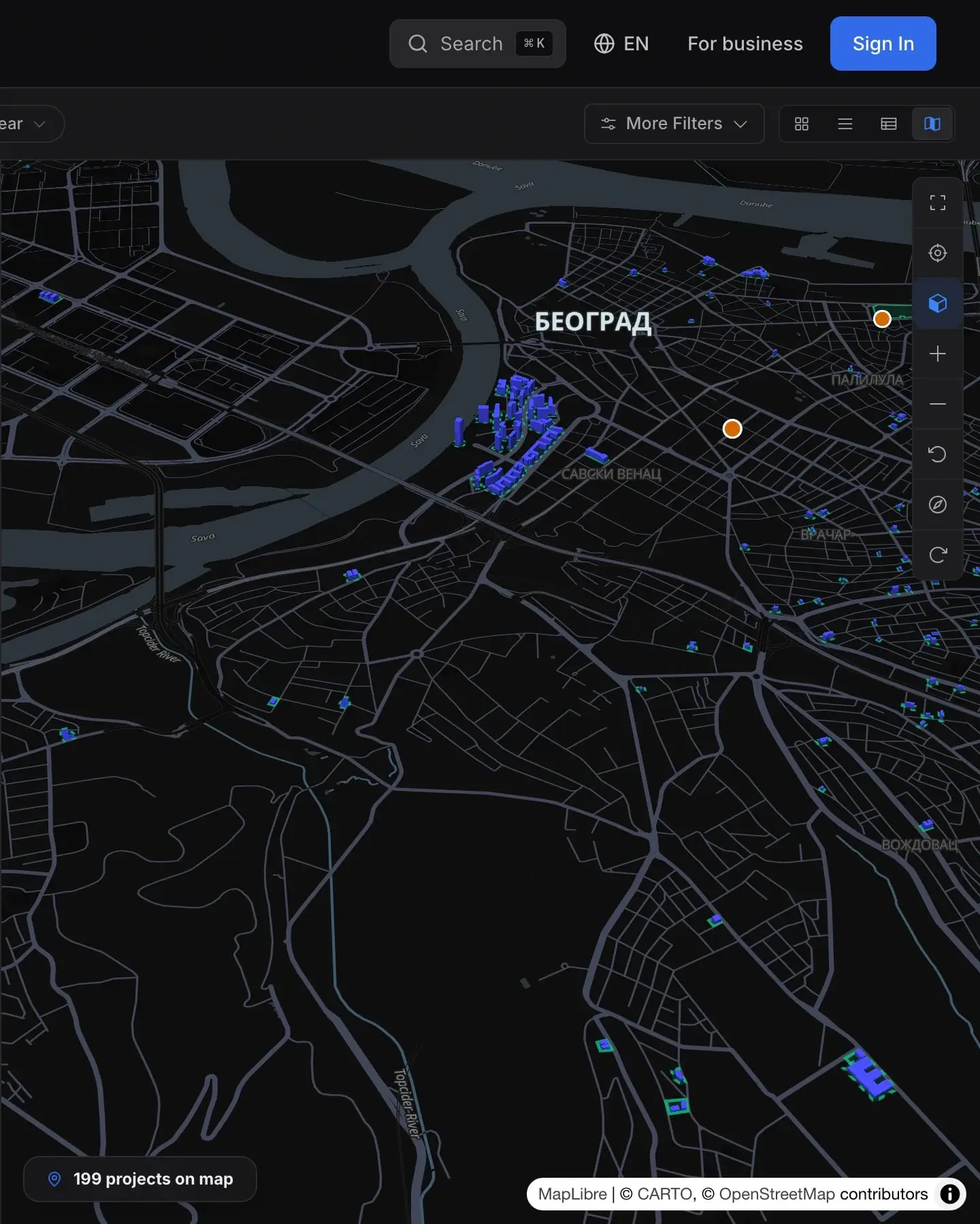
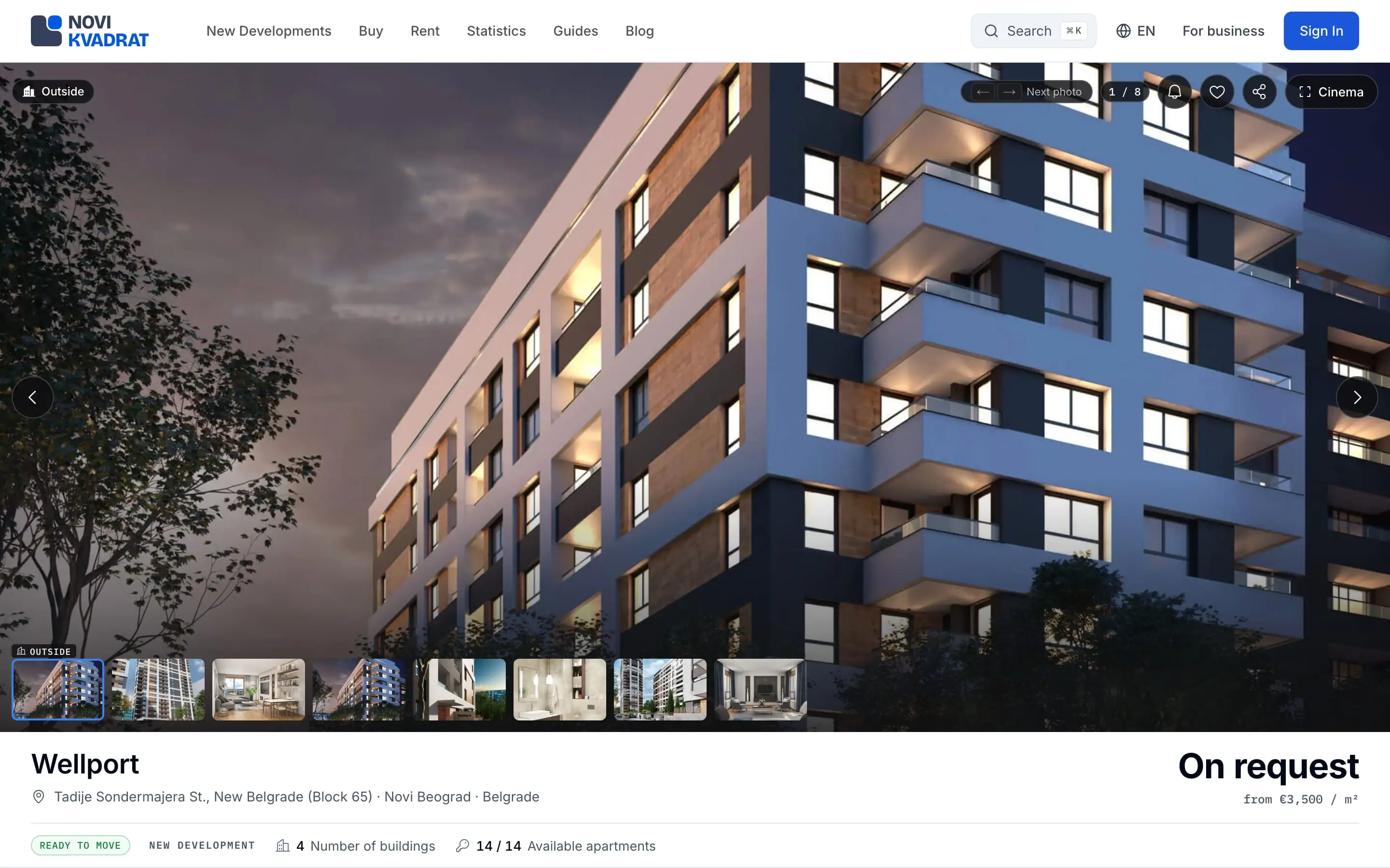
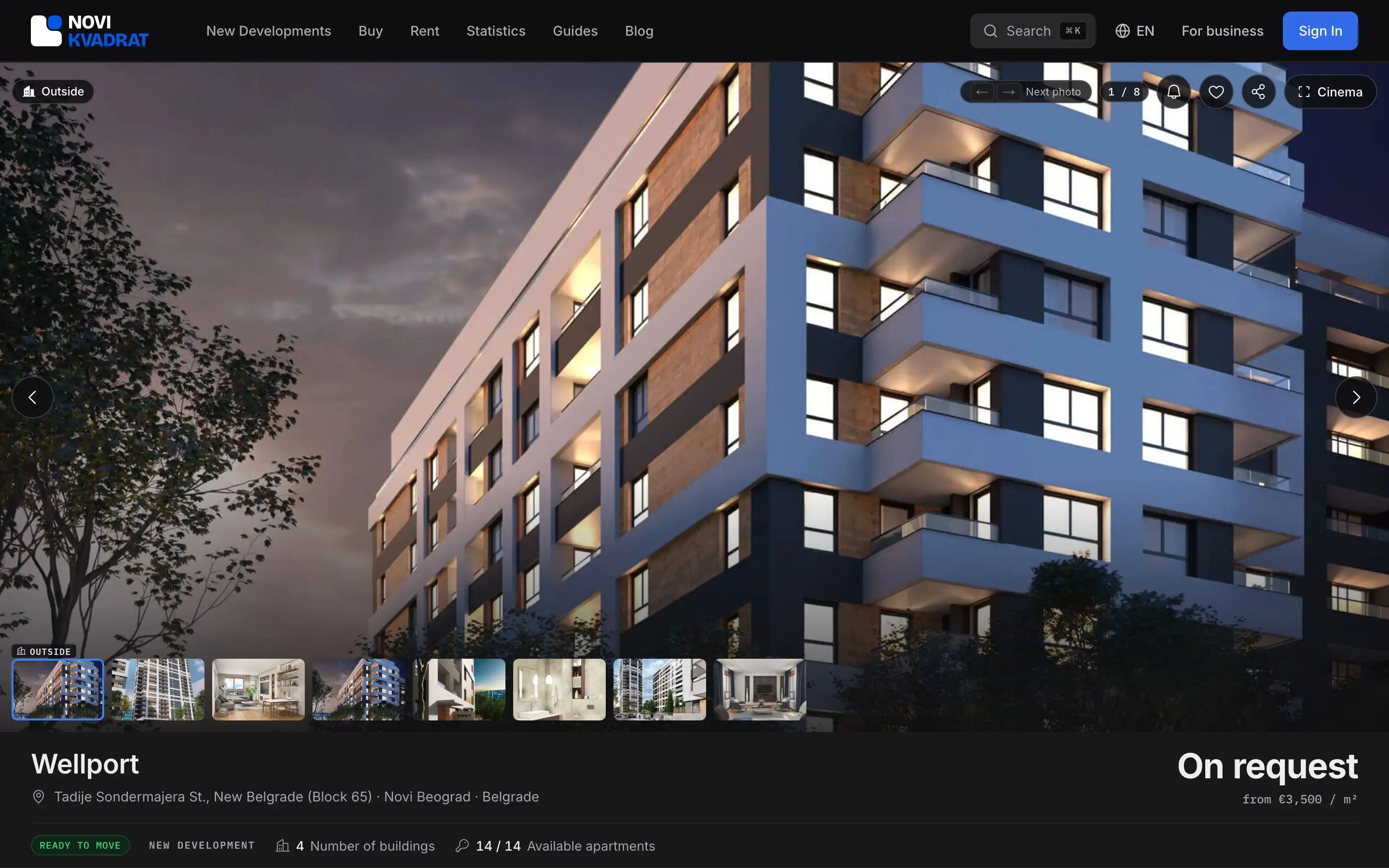
Every page ships in both themes. The dark theme is not an inversion: each of the 187 roles has its own dark value.
Quality
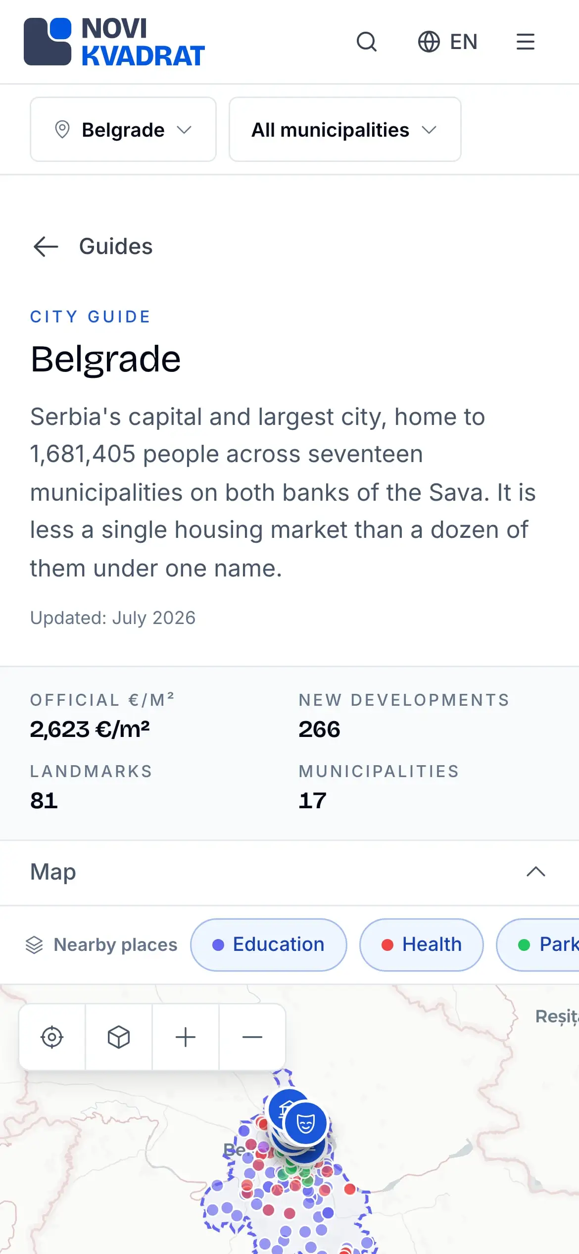
Screenshots pin every screen in both themes, on a desktop and on a phone, so drift is caught before it ships.
The press kit
The kit holds 10 logo files in vector and transparent PNG, the logo and the mark also with their clear space built in, the design tokens, and 18 product screenshots: desktop light, desktop dark and phone. Each logo file is named for its use, never “light” or “dark”, which brands use for opposite things. It was generated from source on 8 October 2026.
wc -l
as of Oct 2026- colour roles, light and dark
- 187
- type steps
- 21
- visual-regression baselines
- 1,023
- files in the code layer
- ~350
- spacing steps
- 11
- radii
- 7
- control heights · shadows · durations
- 3 · 3 · 3
- z-index layers
- 6
- boards in the first library
- 19
- logo files in the press kit
- 10
Stack
frontend
- Tailwind CSS
- styling under the design-system layer
design
- Bricolage Grotesque
- public headings and big numbers
- Inter
- text and every interface label
- IBM Plex Mono
- data and labels, always tabular
- Phosphor
- one icon library across every surface
- W3C Design Tokens
- the tokens’ format, DTCG 2025.10
other
- Vitest and Playwright
- unit tests and visual baselines
Timeline
- Design and build begin
- The press kit is generated from source