case 04 / 05shipped
Axel Properties
A brand system for a riverside development, from mark to signage.
- role
- Design Lead: strategy, identity, guidelines
- period
- Q3 2025
- client
- Axel Properties
- public
- axelproperties.com
at a glance
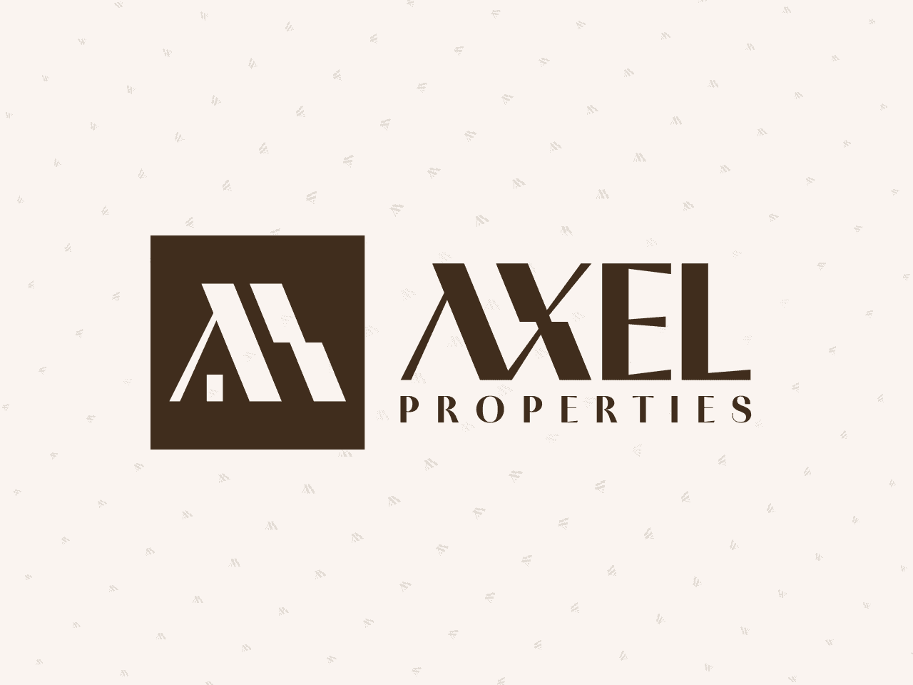
- An identity for a riverside development near Belgrade: affordable luxury with architectural confidence.
- From the mark to signage: logo suite, colour, type, icons, patterns and four families of applications.
- 15 primary colours mapped to NCS, RAL and Pantone, each shipped as a CSS token.
- Rules that prevent misuse and speed up roll-out, in 38 guideline sections.
- assets delivered
- 42
- launch
- Q3 2025
- guideline sections
- 38
- primary colours, mapped to NCS, RAL, Pantone, CMYK, LAB
- 15
The brief
Axel Properties builds along the Danube, near Belgrade, on one idea: affordable luxury. Modern architecture in natural surroundings; safe, elegant and sustainable living for families and businesses. Three values run through it: trust, accessibility, elegance. The identity had four jobs.
- A distinctive, timeless mark that works on signage and in UI.
- A warm, premium palette aligned with materiality and lifestyle.
- A display and UI typography pairing for elegance and clarity.
- Clear rules that prevent misuse and speed up roll-out.
Logo construction
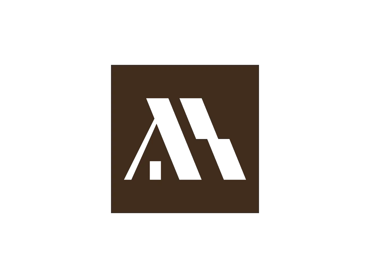
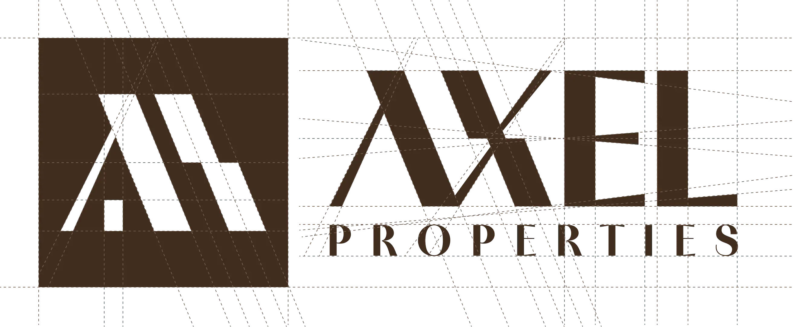
Two ideas hold the mark. The intersecting apex is the structural peak: ambition, precision, stability. The foundational pillar is the anchor: trust, resilience, long-term value. The tone is modern, warm and grounded: luxury that feels livable rather than ostentatious.
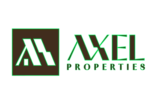
- Horizontal guides: the square, the stroke tops, the step, the pillar, the baseline.
- Vertical guides: the square’s sides and the pillar’s.
- Diagonals extend the strokes and cross at the apex.
- The square and the strokes fill in; the wordmark follows.
- Last, the notes: apex, pillar, clear space 2x and 1x to the wordmark, minimum size 32 px.
clear space 2xsymbol to wordmark 1xminimum size 32 px
Logo suite
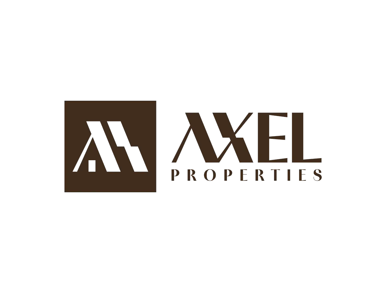
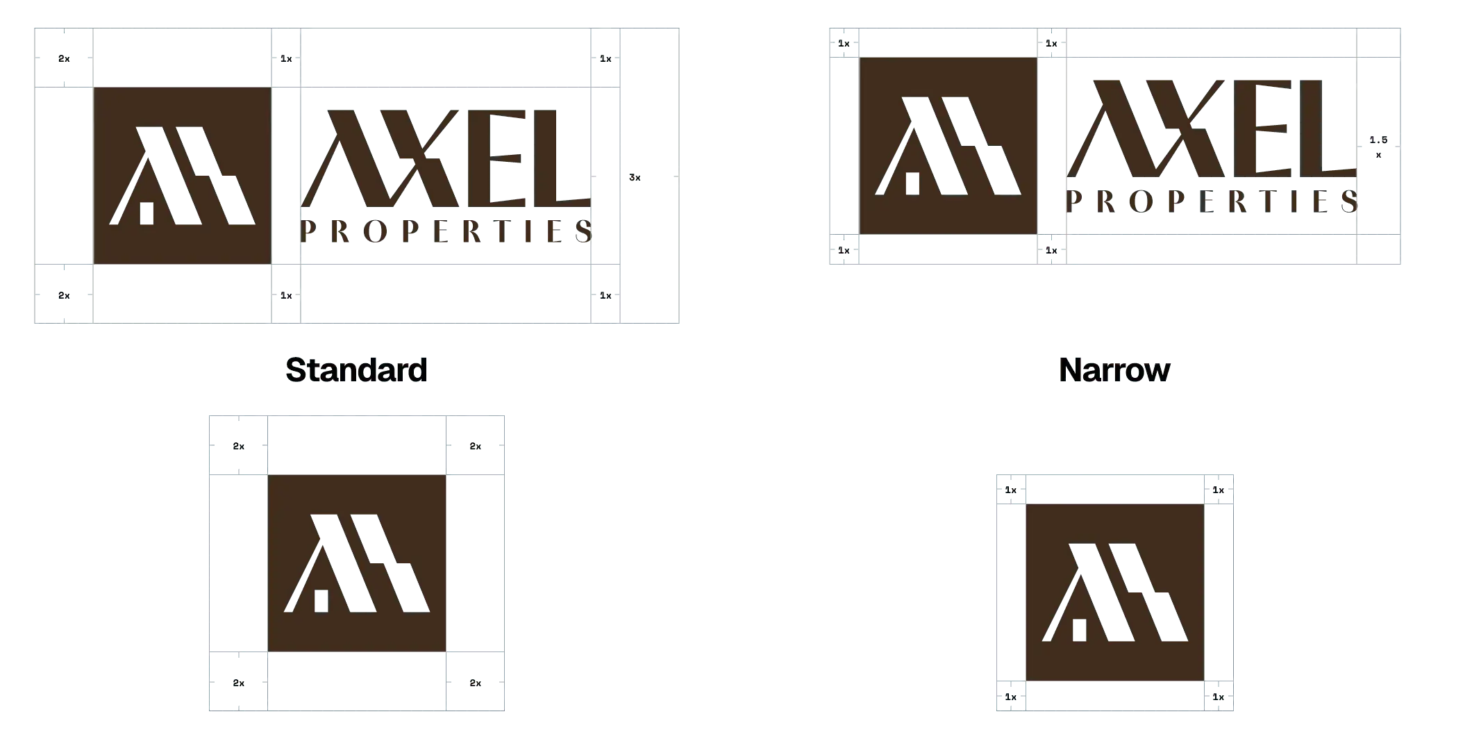
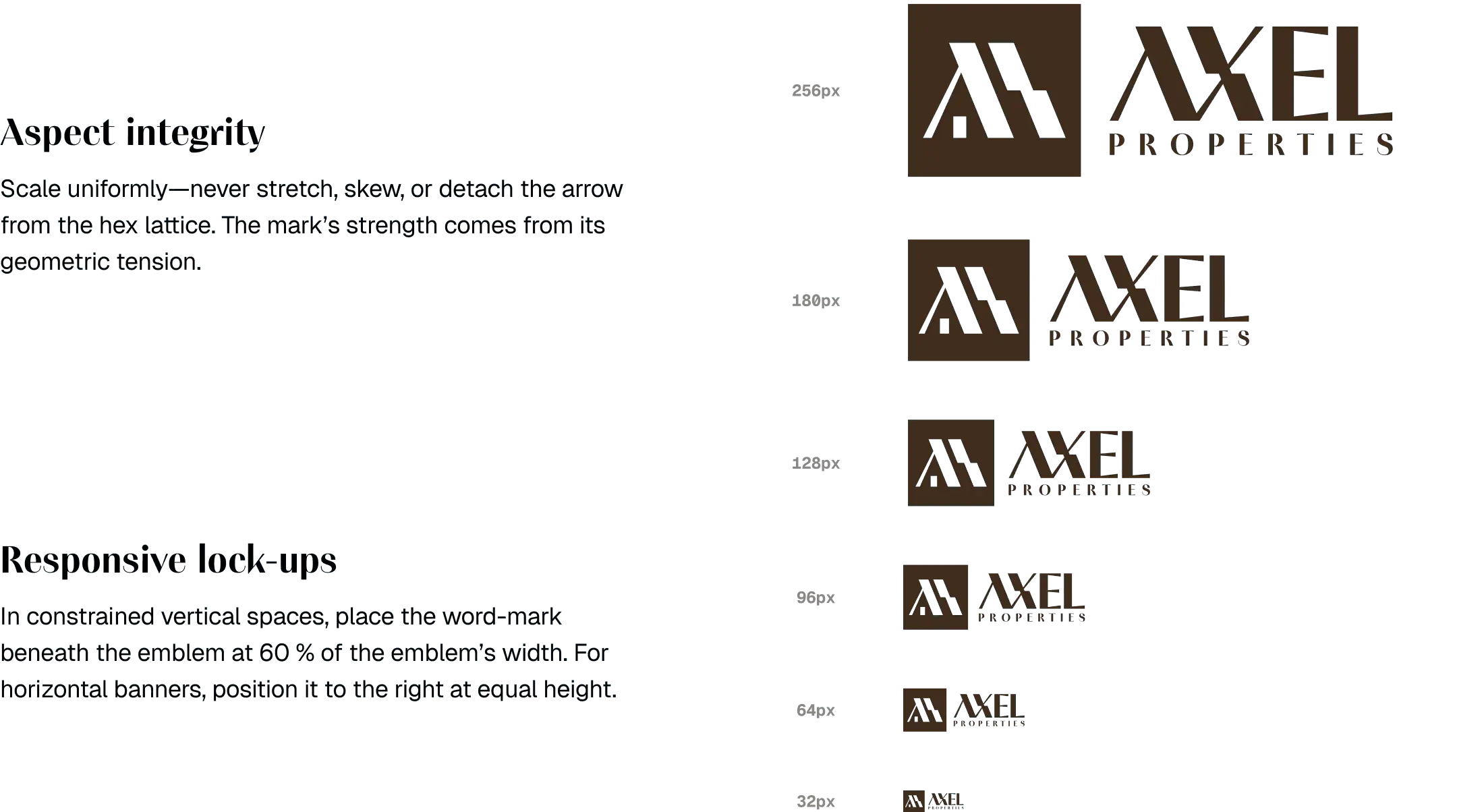
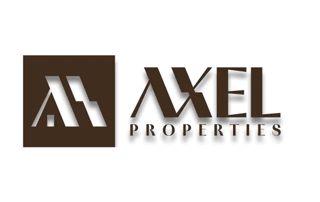
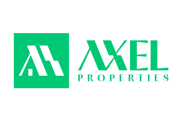
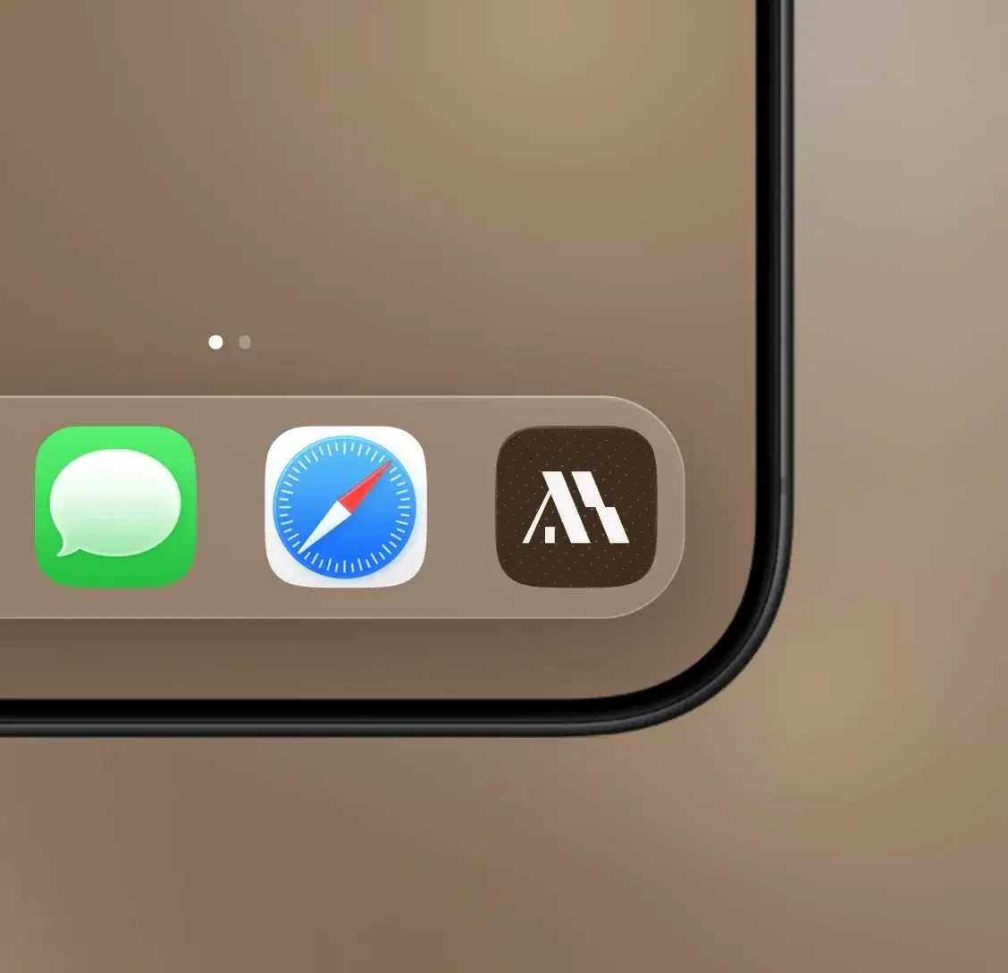
A primary lockup, a secondary mark and a favicon; the lockup comes light and dark. The symbol sits in its own square; the wordmark runs beside it, or beneath it at 60% of the emblem’s width where space is narrow. The scale sheet runs from 256 px down to 32 px.
- Usage: keep the aspect; never stretch, rotate or separate the elements.
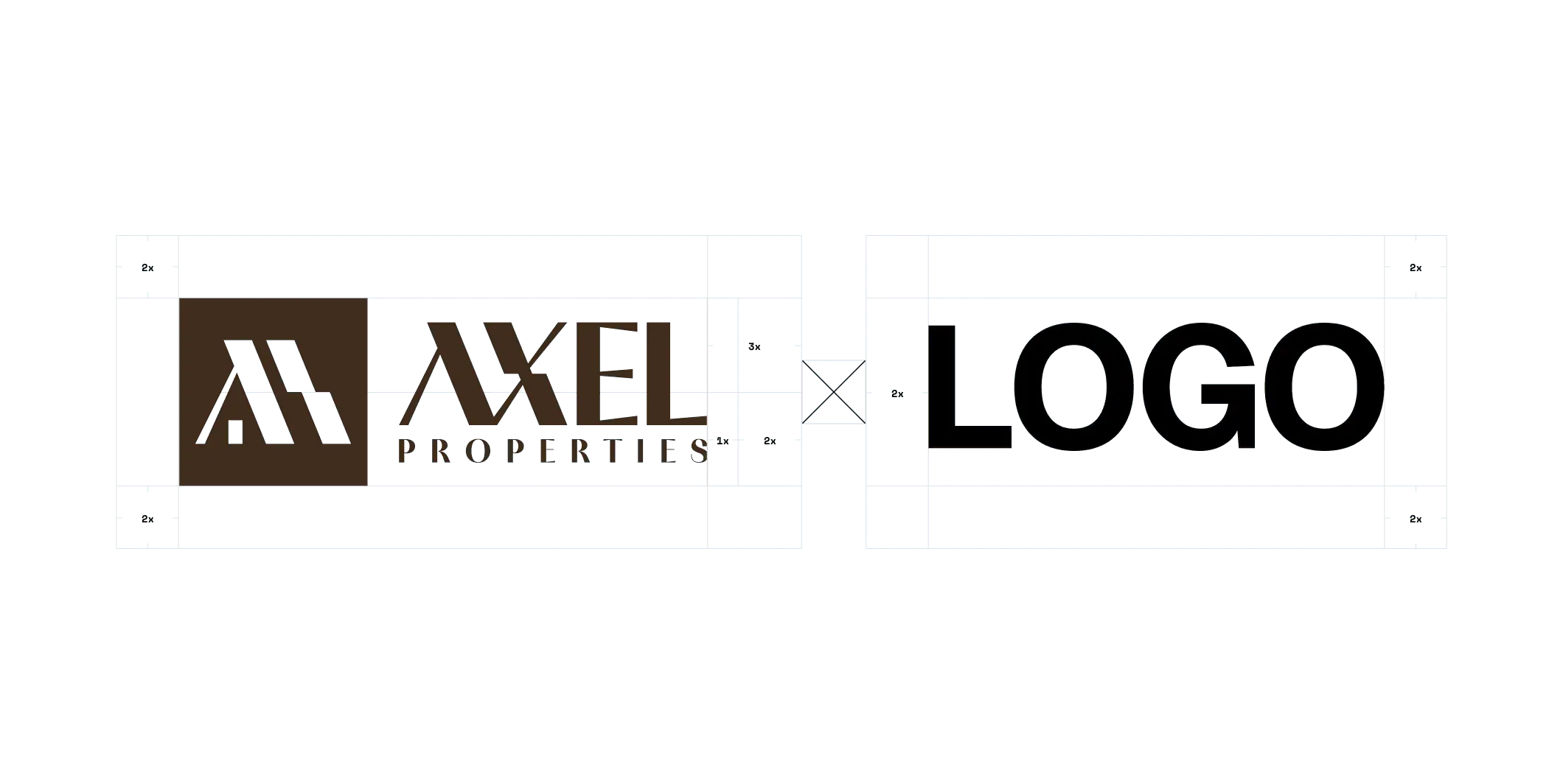
- Clear space: 2x around the symbol, 1x between symbol and wordmark.
- Responsive: stacked when narrow, horizontal on banners.
- Don’ts: no gradients, drop shadows or other palettes.
Colour system
Fifteen primary tones from near-white to near-black, each mapped to NCS, RAL and Pantone, with CMYK and LAB values for print, paint and screen. Ten neutral greys and pure black and white complete it. Every colour ships as a CSS token.
- primary-010#FAF9F7S 0500-N250, 249, 247
- primary-025#FAF5EFS 0502-Y50R250, 245, 239
- primary-050#F5EADES 0804-Y50R245, 234, 222
- primary-075#EFE1D2S 1005-Y50R239, 225, 210
- primary-100#E7CEB5S 1510-Y40R231, 206, 181
- primary-200#D8BEA4S 2010-Y40R216, 190, 164
- primary-300#C3A996S 3010-Y50R195, 169, 150
- primary-400#AB9383S 4010-Y50R171, 147, 131
- primary-500#937B6BS 5010-Y50R147, 123, 107
- primary-600#7A6254S 6010-Y50R122, 98, 84
- primary-700#664C3DS 7010-Y50R102, 76, 61
- primary-800#442C1AS 8010-Y50R68, 44, 26
- primary-900#332210S 8505-Y50R51, 34, 16
- primary-950#2B1A12S 8505-Y80R43, 26, 18
- primary-1000#0D0E0ES 9000-N13, 14, 14
- gray-50#FAFAFA250, 250, 250
- gray-100#F5F5F5245, 245, 245
- gray-200#E8E8E8232, 232, 232
- gray-300#D6D6D6214, 214, 214
- gray-400#A6A6A6166, 166, 166
- gray-500#787878120, 120, 120
- gray-600#59595989, 89, 89
- gray-700#45454569, 69, 69
- gray-800#2B2B2B43, 43, 43
- gray-900#0D0D0D13, 13, 13
- pure-white#FFFFFFRAL 9010255, 255, 255
- pure-black#000000RAL 90050, 0, 0
Typography
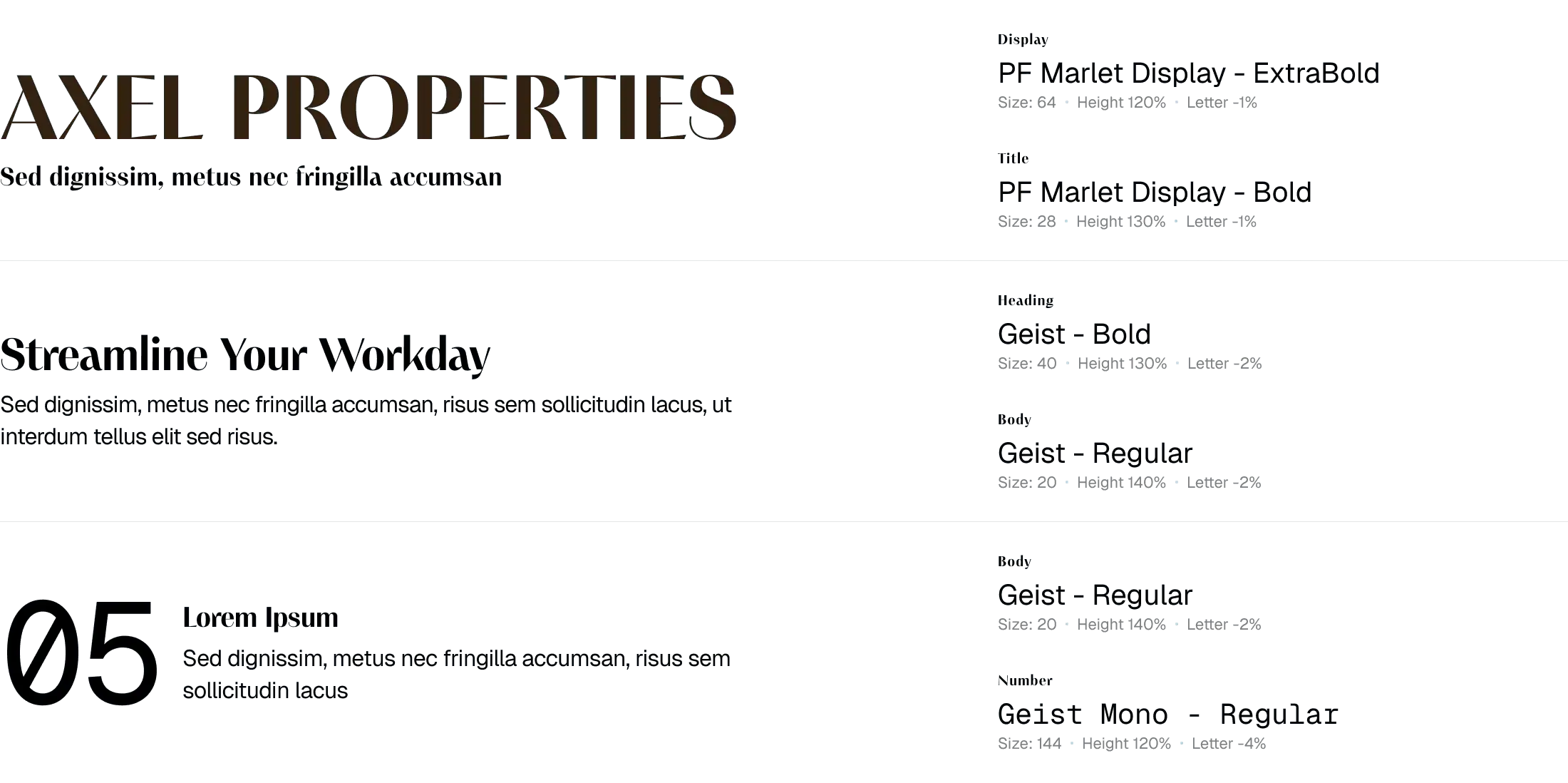
PF Marlet Display carries the display, heading and title roles, with Bodoni Moda as the alternative. Geist sets subtitles, calls to action and body text; Geist Mono sets the numbers. The typefaces are not loaded here: the hierarchy sheet shows them.
| role | typeface |
|---|---|
| display, heading, title | PF Marlet Display |
| subtitle, CTA, body | Geist |
| numbers | Geist Mono |
| alternative | Bodoni Moda |
Iconography and patterns
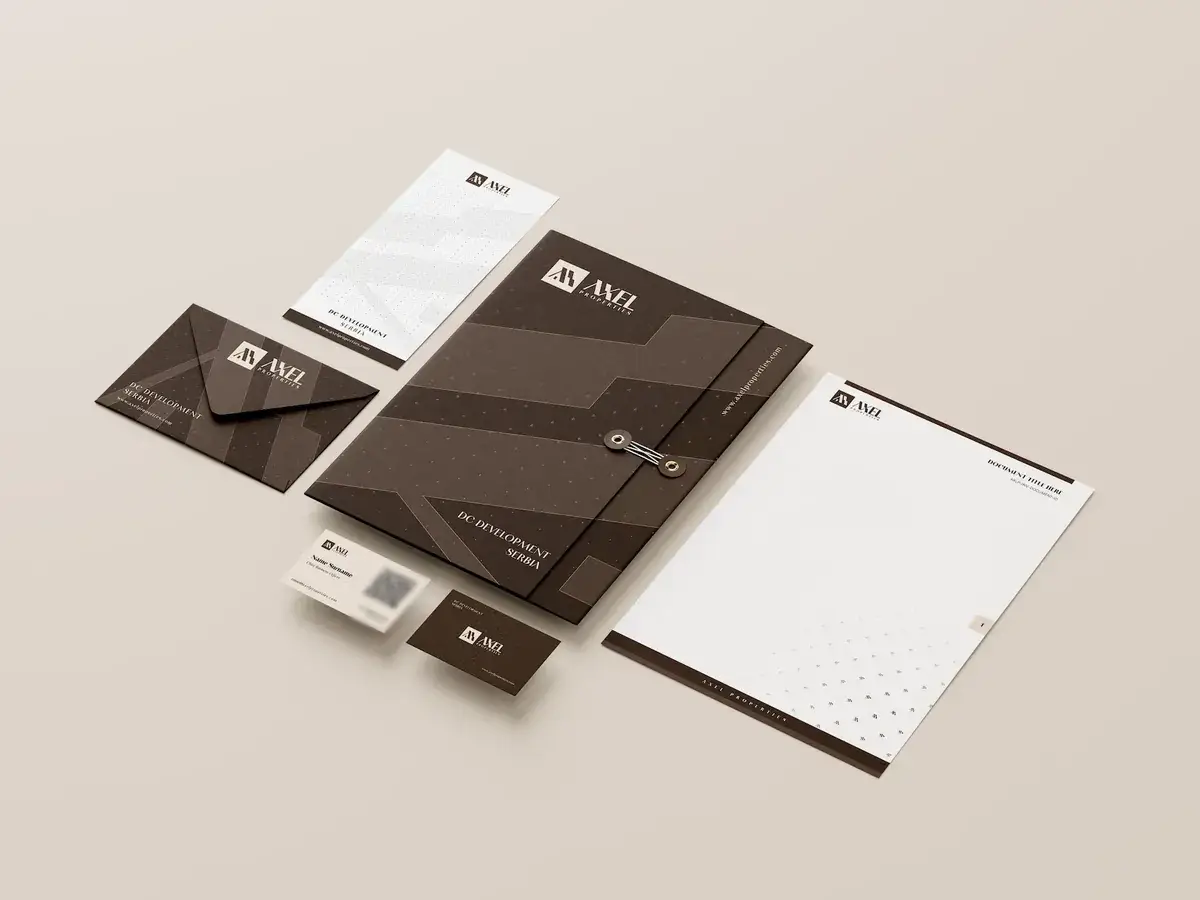
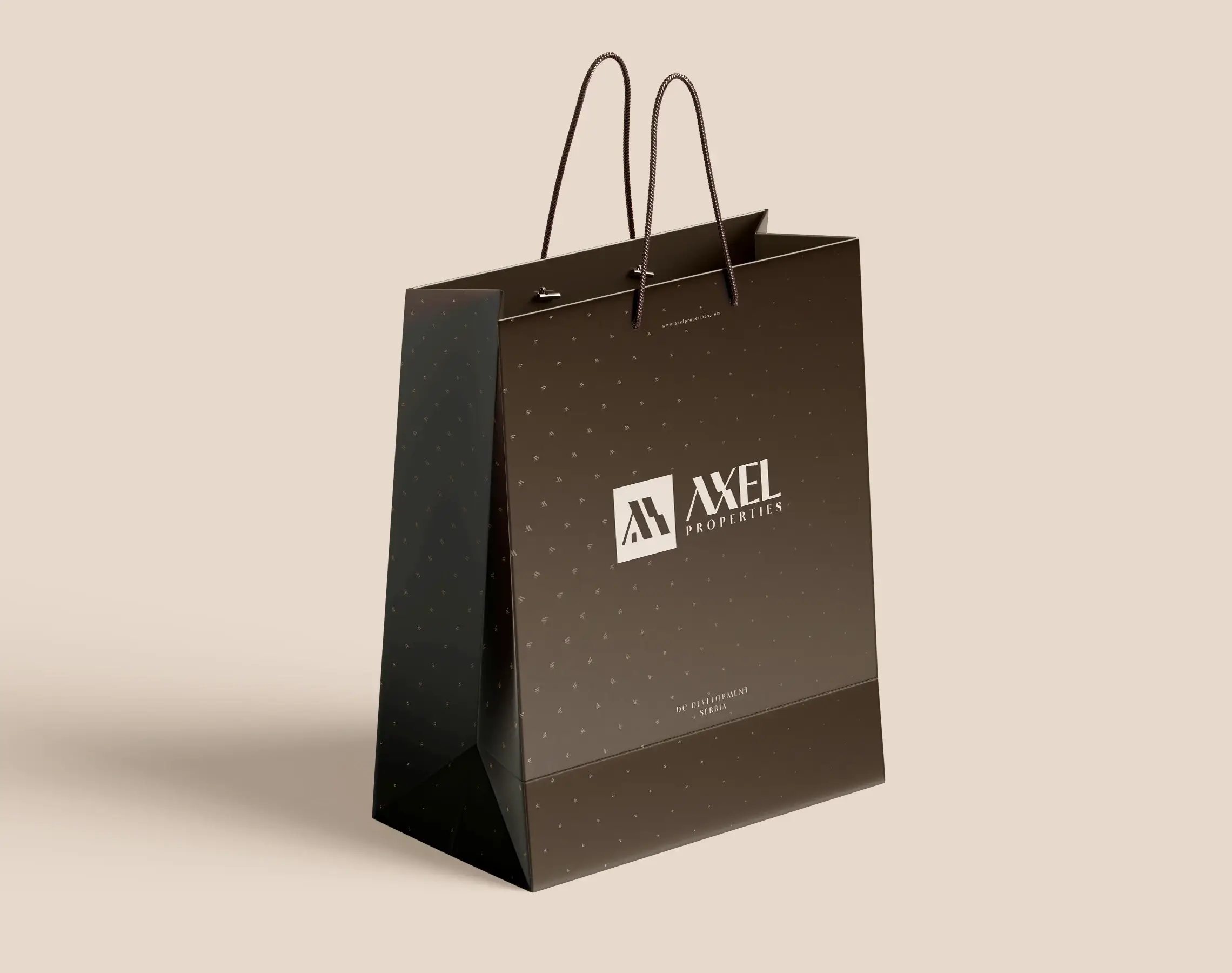
One icon library, Phosphor, keeps every pictogram on the same stroke. The patterns scatter the mark across a surface at a changing density, on cream and on brown, so a letterhead and a bag carry the same motif.




Applications and showcase
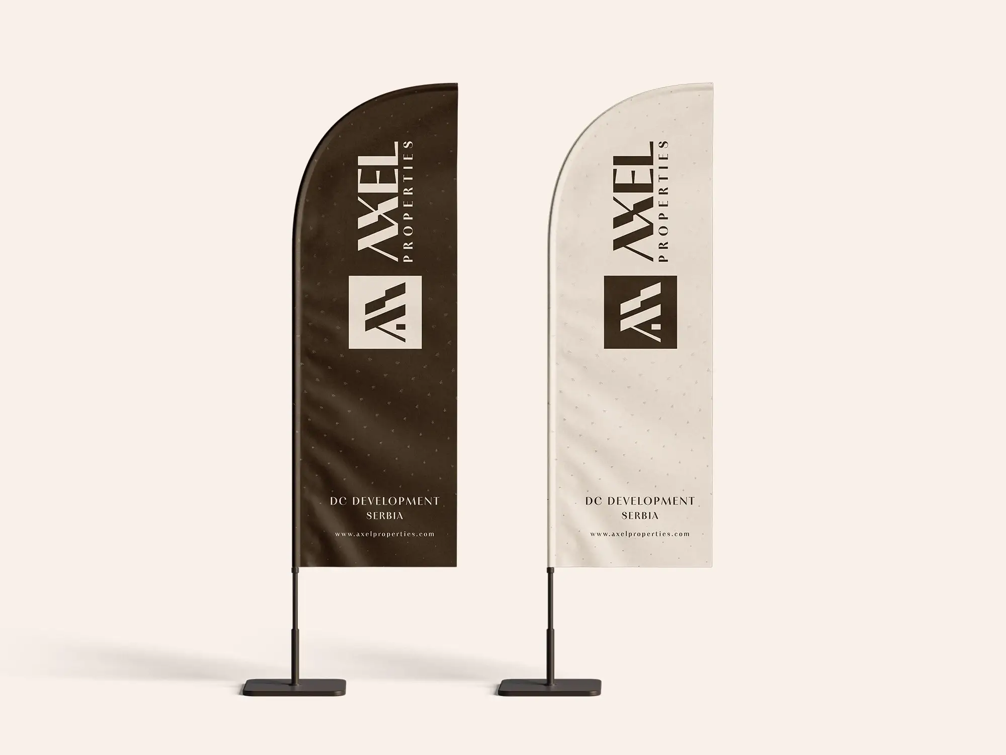
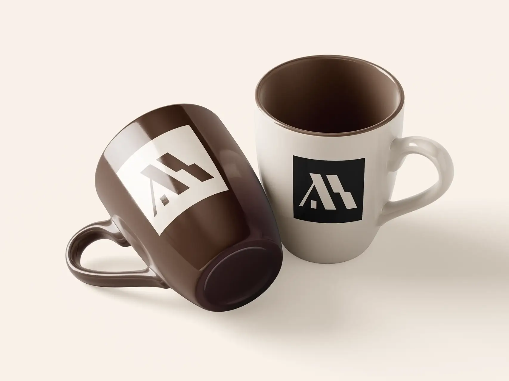
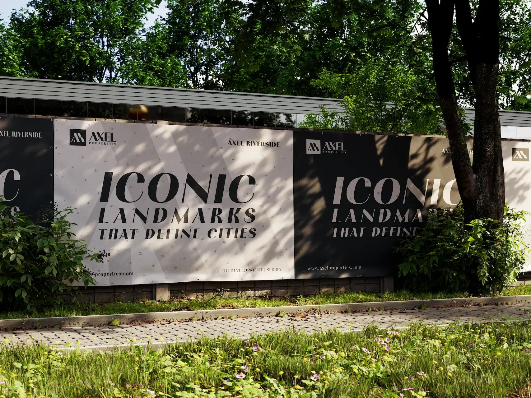
Four families, from the first business card to the site hoarding.
- Stationery: cards, letterhead, envelopes.
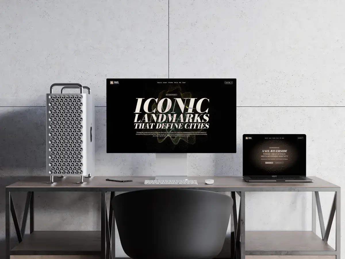
- Digital: website UI kit, social headers, ad sets.
- Environmental: signage, flags, outdoor ads.
- Marketing: brochures, launch collateral.
Process
four stages, all done- discoverymarket scan, audience mapping, competitive audit; the positioning: affordable luxury by the Danube
- explorationsymbol studies, grid construction, palette testing; small-scale legibility
- systemizationlockups, spacing ratios, responsive behaviours, co-branding; do’s and don’ts
- validationenvironmental mockups, signage tests, UI kit checks, print proofing
Results
as of Aug 2025The identity scales cleanly across print, web and on-site signage. Clear rules reduce misuse and speed up production; the warm neutral palette says livable luxury without excess.
- assets delivered
- 42
- launch
- Q3 2025
- guideline sections
- 38
- primary colours, mapped to NCS, RAL, Pantone, CMYK, LAB
- 15
- neutrals, plus black and white
- 10 + 2
- typefaces, plus one alternative
- 3 + 1
- don’ts
- 6
- patterns
- 4
- application families
- 4
- scale sheet
- 256 → 32 px
Notes and credits
Keep the geometry and warmth balanced: luxurious, but grounded. Leave breathing room in layouts; let the palette carry the tone rather than heavy effects.
Abdullah Kahvecioglu · Design Lead · axelproperties.com
© 2025 Axel Properties — All rights reserved. This brand identity was developed exclusively for Axel Properties and may not be reproduced, modified, or used without prior written permission. Fonts and iconography are licensed to their respective owners.